Create Tanaka Contours in ArcMap

Background
As part of some development work I've been doing for an advanced Geovisualization course I'm teaching, I had to come up with a simple way of creating Illuminated contours (a.k.a Tanaka Contours) in ArcMap. There are a few methods out there that use more sophisticated math for computing the shade values on the contours.
There is an ArcNews Article by Patrick J. Kennelly, and A. Jon Kimerling, that outlines several advanced cartographic methods (but does not provide detailed steps). Also, a blog post by Josh Ryan shows detailed steps for computing Tanaka Contours, but involves some robust raster algebra which probably produces 'truer' results. I wanted as simple a method as possible, so have forgone the advanced math on hillshades in favour of simply using aspect.
Before diving in, it's important to note results will be dependent on data. Contour interval, DEM resolution and final display scale all factor in to your results. Experiment on a small data subset first. Interestingly, you'll get better results with a more generalized DEM and a higher contour interval. Smooth contours also work best.
This blog outlines some basic steps that can be done in ArcMap to generate Tanaka Contours. While I developed this in 10.2, I see no reason why it wouldn't work in earlier versions - nothing fancy here. These steps are only a guideline - users may want to refine the steps, and perform further data refinements, generalizations and also explore other symbolization options. You'll need either the Spatial Analyst or 3D Analyst extension for some of these steps.
Of course, if someone was keen, all this could be strung together in a Model Builder Model, but I wanted my students to go through the steps.
Steps
Start with a Raster DEM. Here's one you can use for Mt St. Helens. If desired contour lines already exist, skip to step #3
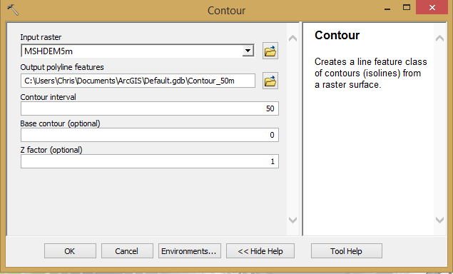
1. Generate contours in Spatial or 3D using
"Contour" GP tool. Select desired interval…

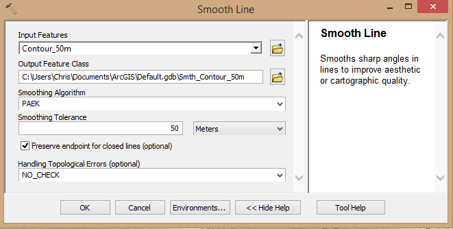
2. (Optional but recommended) Smooth the generated contours using the “Smooth Lines” GP tool. You may want to test the smoothing tolerance..
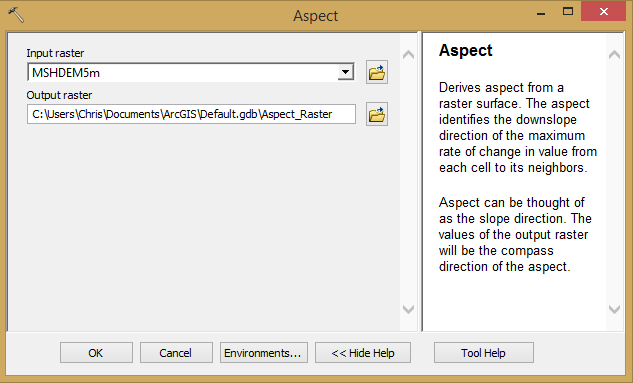
3. Generate aspect surface using the "Aspect" GP tool. Results will be added as classified raster.
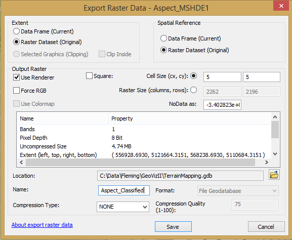
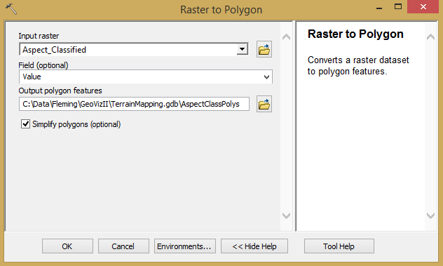
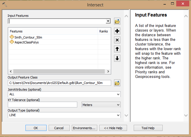
7. Symbolize the final line feature class. You will have an attribute called “gridcode” which you need to symbolize by. It contains values from 1 to 9. Use the table below to set the symbolized values for a grayscale map. You can modify these to use other colours or even use line widths
“gridcode” value
|
Direction
(reference)
|
Colour (gray)
|
Line width
(any colour)
|
1
|
N (0+)
|
10% Gray
|
0.50 pt
|
2
|
NE
|
30% Gray
|
1.00 pt
|
3
|
E
|
50% Gray
|
2.00 pt
|
4
|
SE
|
70% Gray
|
3.00 pt
|
5
|
S
|
50% Gray
|
2.00 pt
|
6
|
SW
|
30% Gray
|
1.00 pt
|
7
|
W
|
10% Gray
|
0.50 pt
|
8
|
NW
|
White
|
0.10 pt
|
9
|
N (360-)
|
10% Gray
|
0.50 pt
|
Your "Symbology" tab for the "Layer Properties" should look something like the examples below. These were done using a DEM for Mt St. Helens.
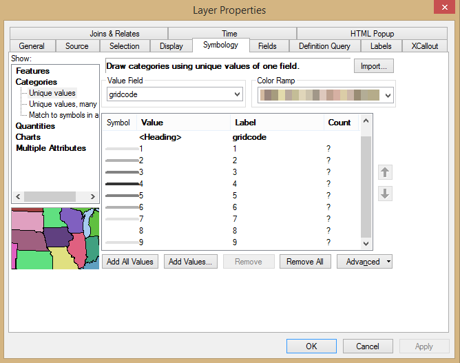
Using the gray shading method, you'll have symbology that looks like this...
 And will give a map that looks something like this when placed on top of the symbolized original DEM (try setting the layer transparency to 40%)...
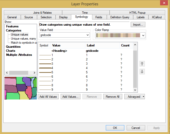
If you choose to vary the contours by line thickness, you'll have symbology that looks like this. I'm using a brown line colour here, and varying the thickness as per the table above. The shade of brown here is Esri's "Leather Brown" (R:137 G:112 B:68)...
 This gives you a map that looks something like this when placed on top of the symbolized original DEM (try setting the layer transparency to 40%)...
To reiterate, Contour interval, DEM resolution and final display scale all factor in to your results. Experiment!
Using the gray shading method, you'll have symbology that looks like this...

If you choose to vary the contours by line thickness, you'll have symbology that looks like this. I'm using a brown line colour here, and varying the thickness as per the table above. The shade of brown here is Esri's "Leather Brown" (R:137 G:112 B:68)...

To reiterate, Contour interval, DEM resolution and final display scale all factor in to your results. Experiment!

